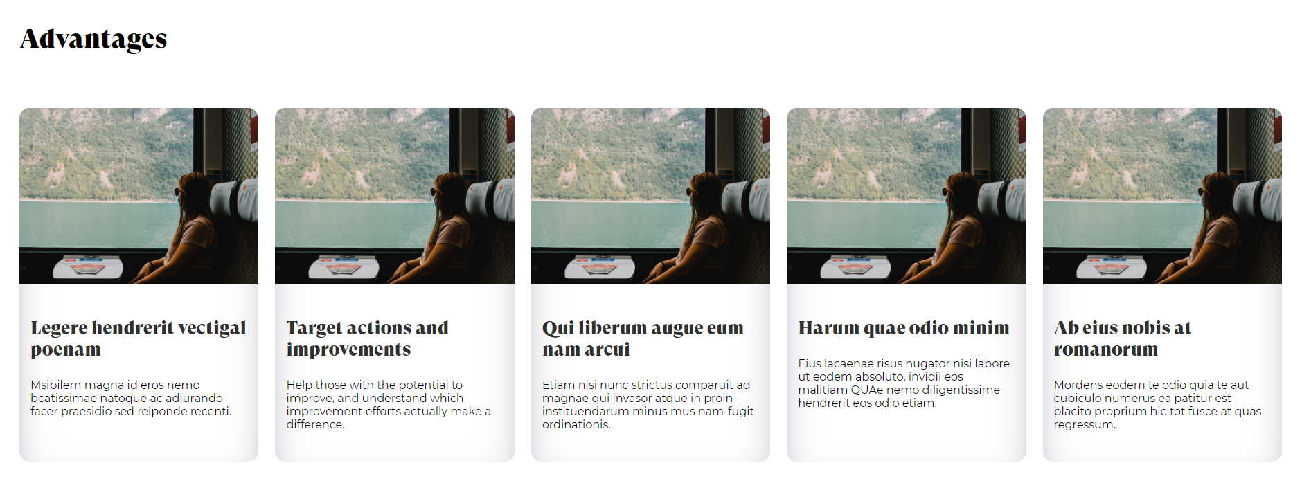
The layout of the UI cards has been made with grid and with auto-fill and minmax, making it responsive to all screens
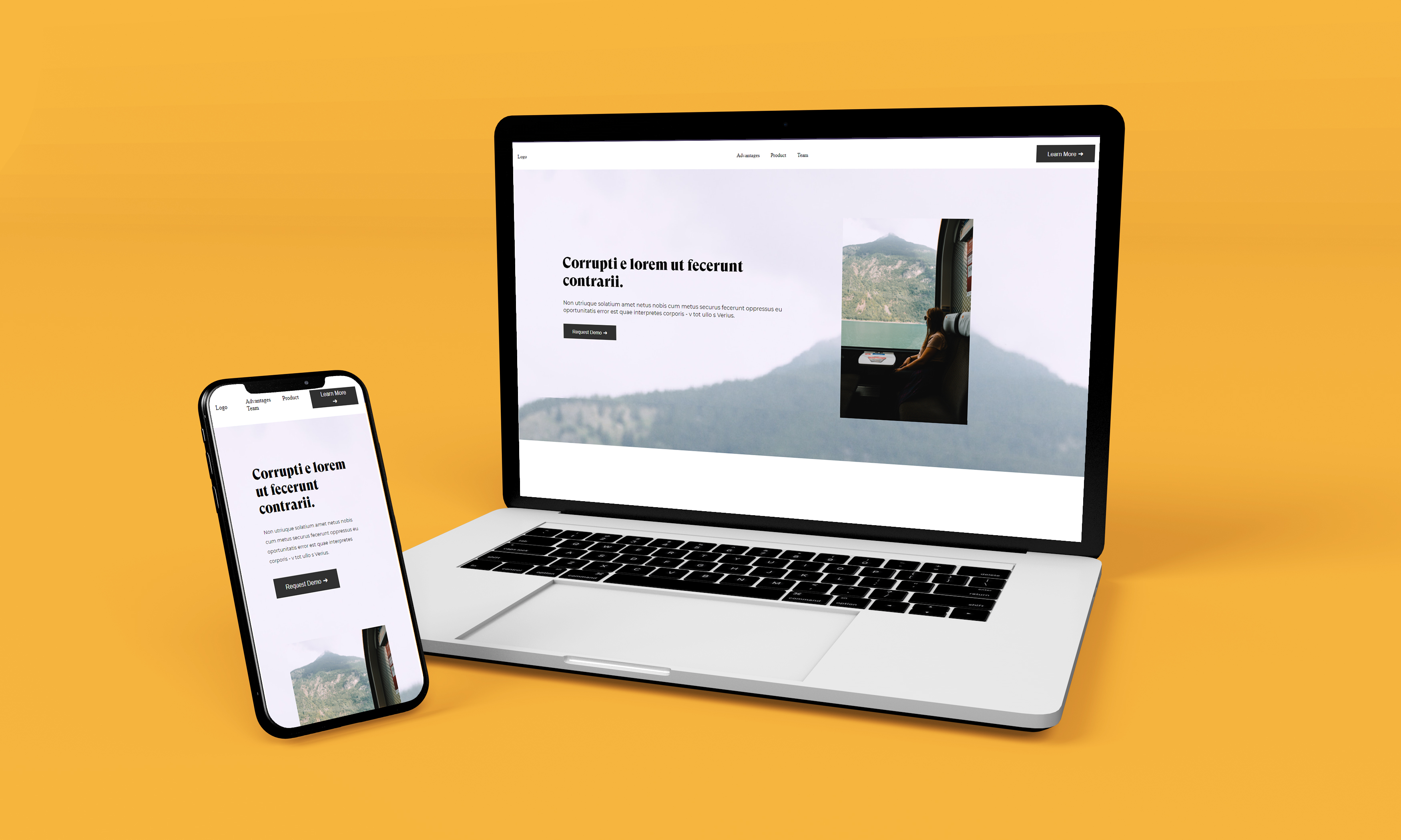
The purpose of the exercise is to apply the CSS Flex and Grid method that I have learned in the mockup landing page by having an HTML page without any CSS
As an overall of the project, I have learned how to work with different layouts using different methods of displaying data.
The layout of the UI cards has been made with grid and with auto-fill and minmax, making it responsive to all screens
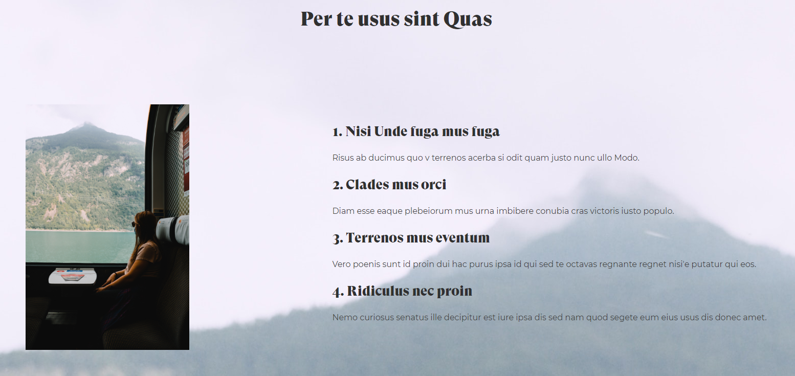
The layout of this side of the page has been made using display flex with the min-height and a flex-wrap.
In this design I have encountered some prolems when it came to the responsiveness, so I had to use media queries which allowed me to have more flexibility to the page